Role
UX/UI Design, UX Research, Prototyping, Design System
Tools Used
Figma
Project time
2 weeks
Understanding the IRCTC Mobile App
The IRCTC mobile app is widely used by millions of people in India to book train tickets, check schedules, and manage bookings. Moreover, it’s an only app to book train ticket to travel from one state to another or to different district within the state. Being an one of the user of this app, I discovered the existing app has usability issues, outdated design, and lacks a smooth user experience.
Goal
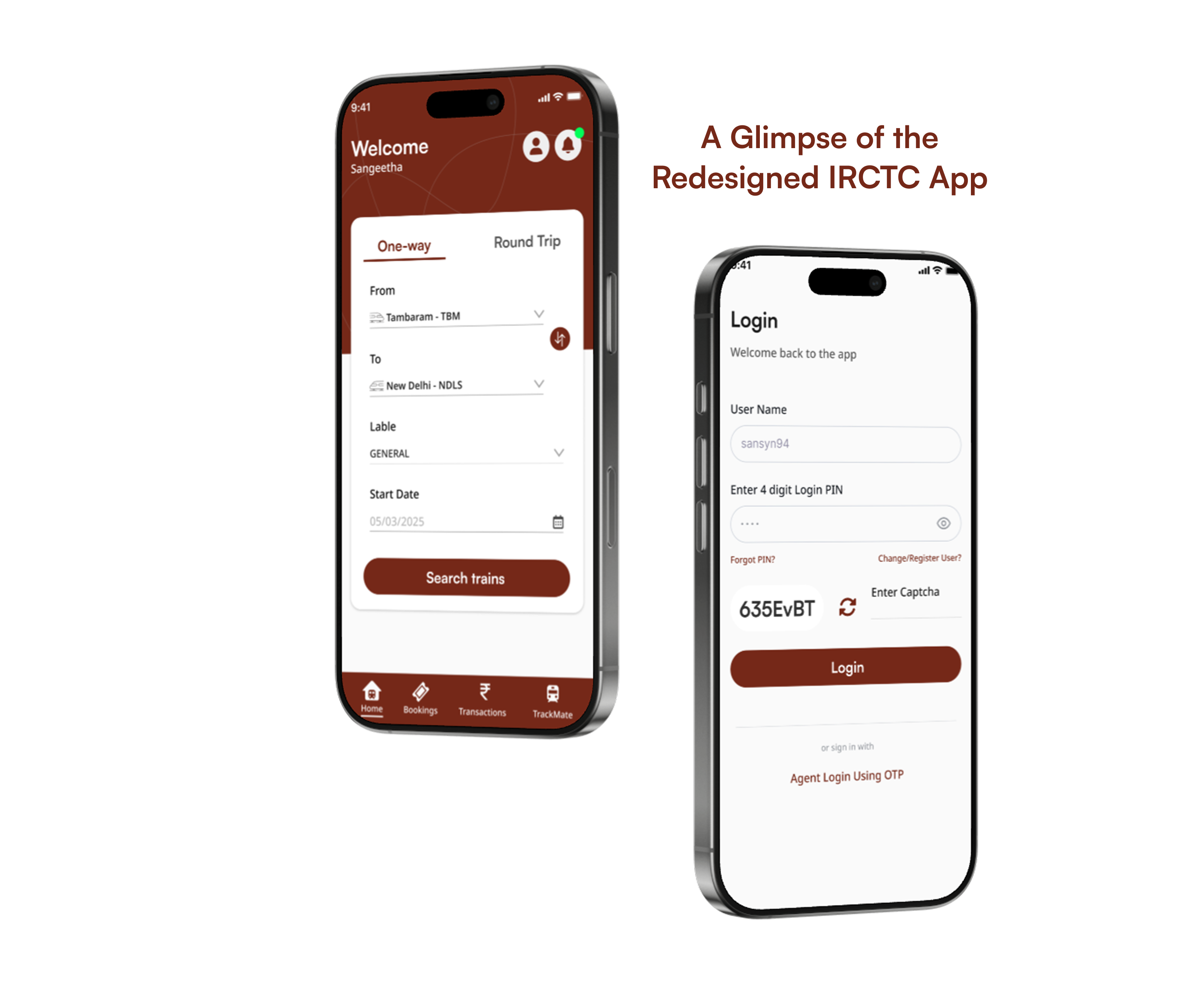
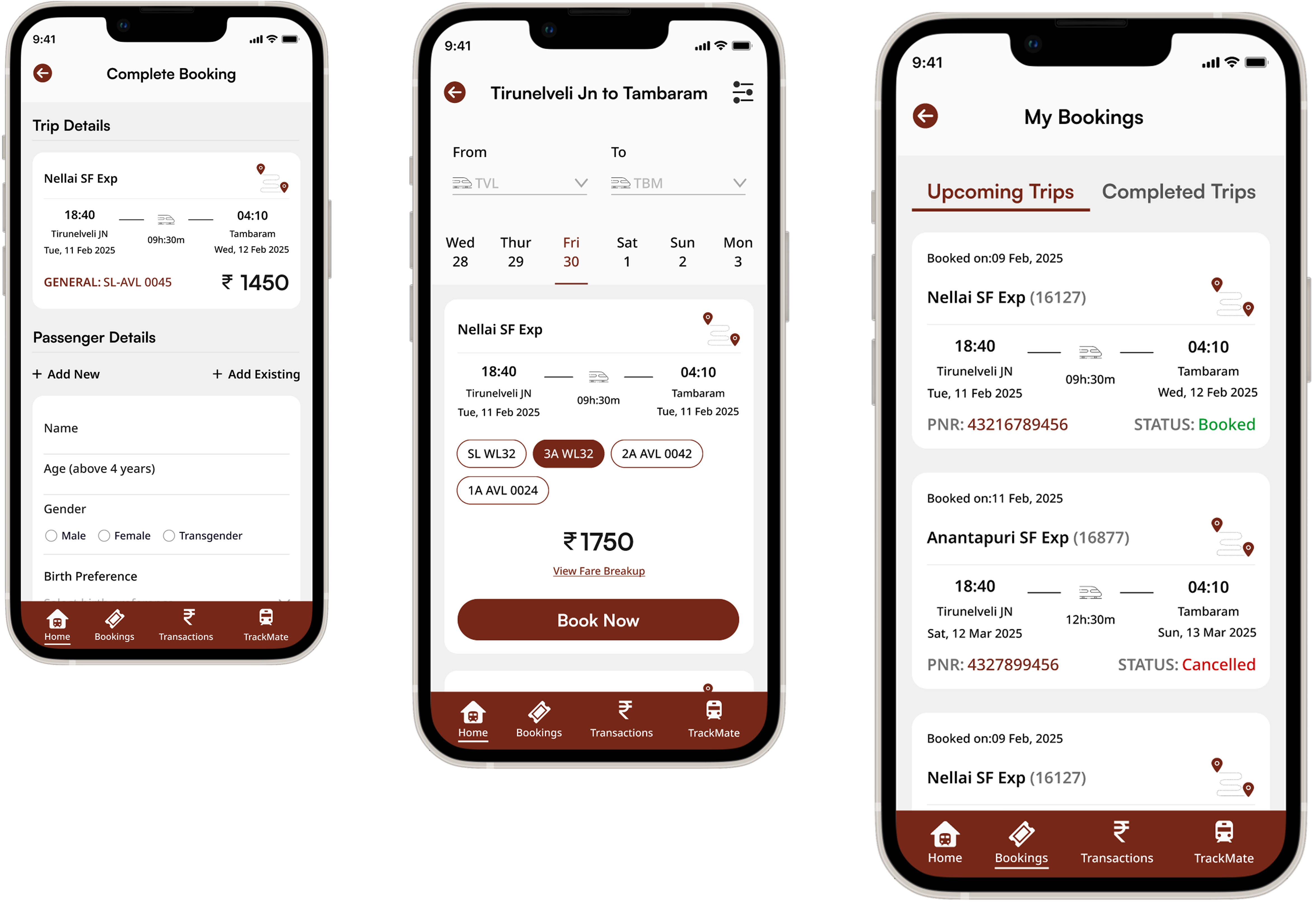
To redesign the IRCTC app out of my own interest to make ticket booking smoother, more user-friendly, and visually appealing. My focus was on key screens like Login/Signup, Search Train, Search Results, Adding Passenger while Booking, and My Booking, as they directly impact users. I did not create screens for the payment gateway and other sections, as my goal was to improve the core booking experience, not redesign the entire app.
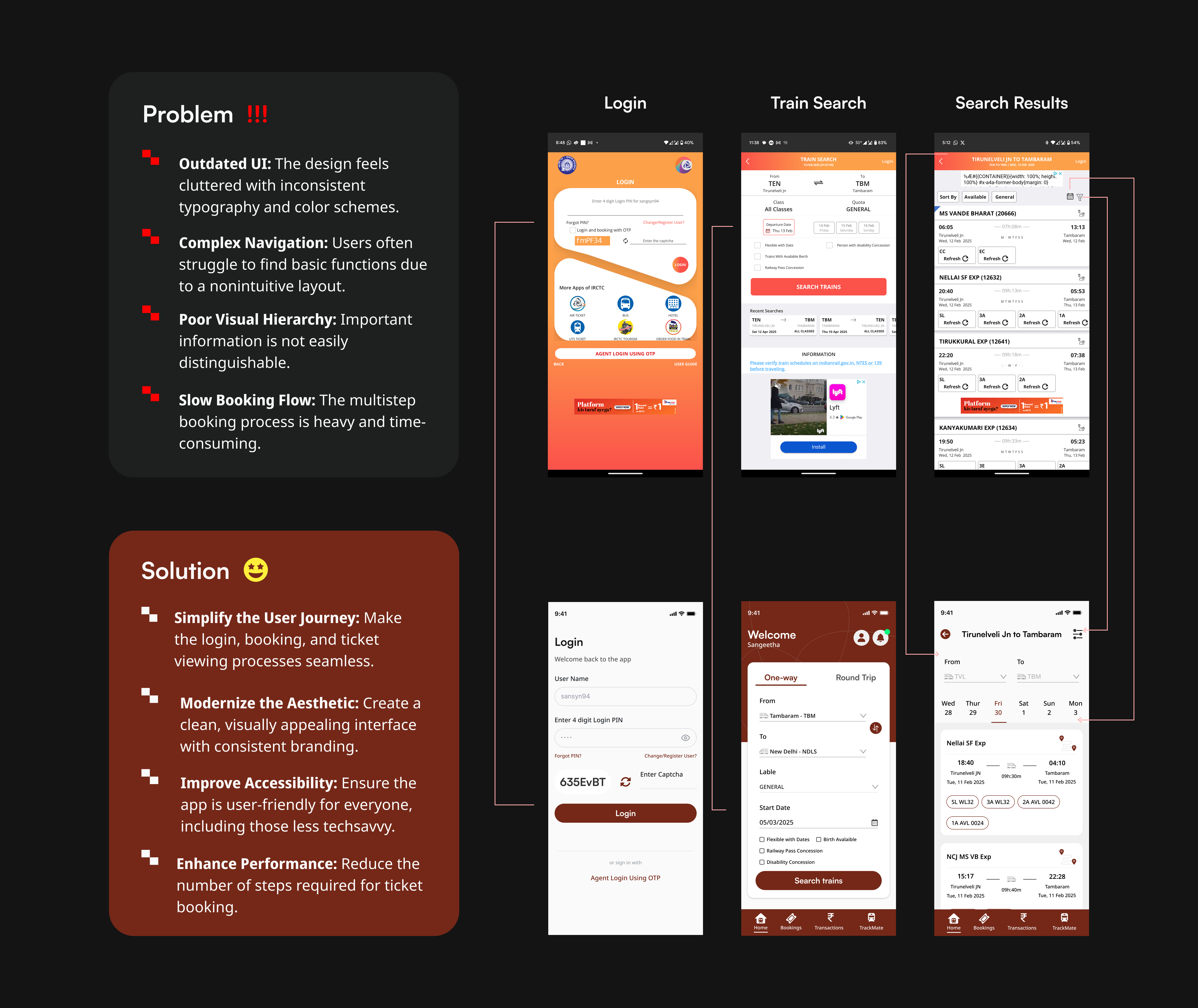
IRCTC: Research & UX Findings (Website vs. Mobile App)
What I found?
“According to data from January 2025, IRCTC has approximately 9.82 crore active users, with daily logins of 25.17 lakh on the website and 62.49 lakh on the mobile app. This indicates that about 71% of daily logins occur via the mobile app, while the remaining 29% are through the website.”
1. Layout & Navigation
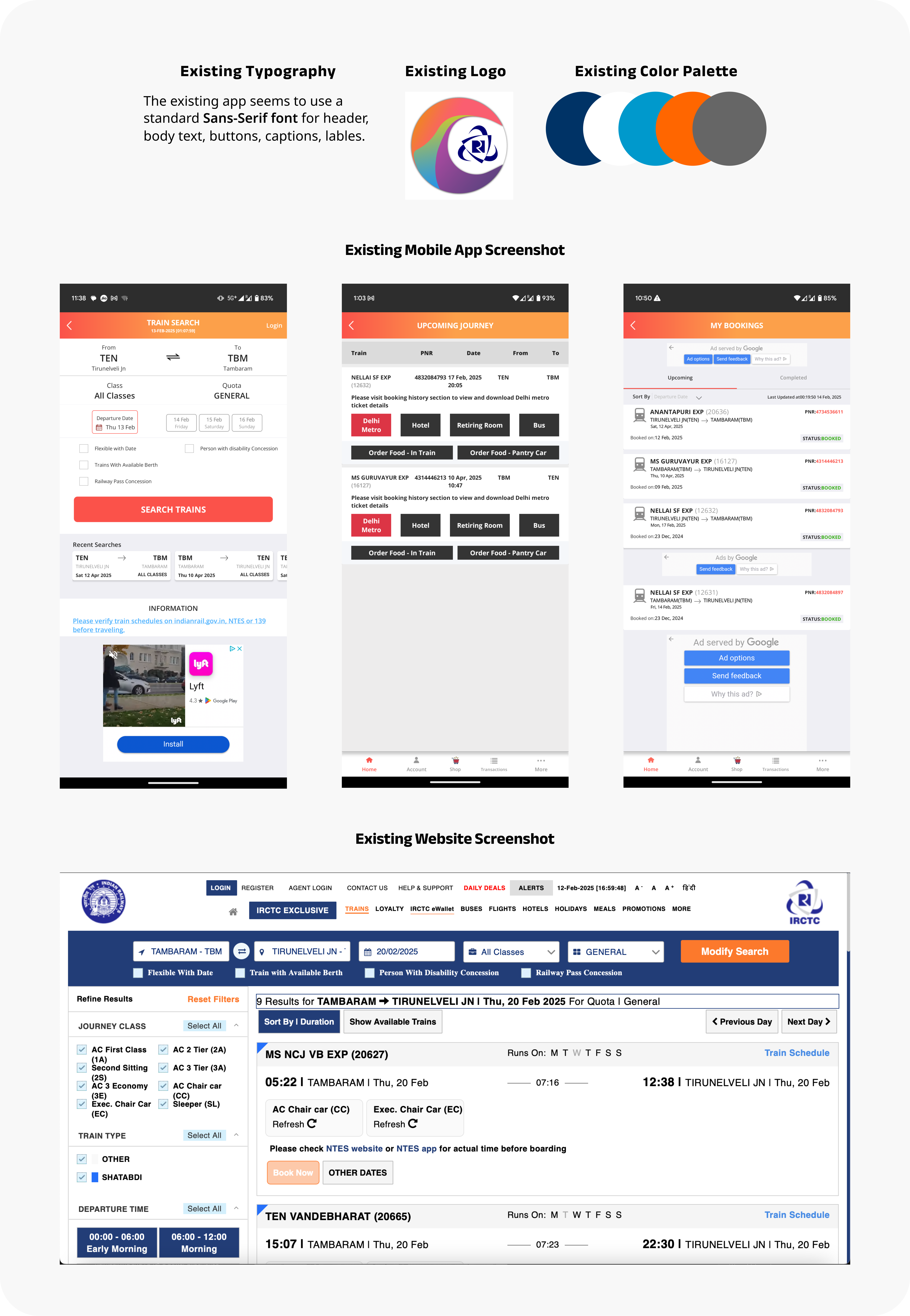
Website: Designed for a large screen, the website has a multi-column layout with a navigation bar, side menus, and multiple sections visible at once. However, it feels cluttered and overwhelming due to too much information being displayed at once.
Mobile App: The app uses a single-column layout to fit smaller screens, with bottom navigation and a more linear flow. But some screens still feel cluttered due to poor spacing and unoptimized elements.
2. UserFlow & Booking Process
Website: The booking flow is spread across multiple steps (login, search, select, confirm, payment). However, users can view multiple trains and options at once, making comparisons easier.
Mobile App: The booking process is more linear, with a step-by-step approach. But frequent session timeouts and navigation issues disrupt the experience.
3. Visual Hierarchy & Readability
Website: The website uses small fonts and too many text-heavy sections, making it difficult to scan information quickly.
Mobile App: The app improves readability slightly but still lacks proper font hierarchy, making some elements hard to distinguish, especially for senior users.
4. Color & UI Elements
Website: Uses blue and white with orange highlights, but the contrast is weak in certain areas.
Mobile App: Does not retains the same color palette, Orange gradient is used across the mobile app for header, button etc. Also, the buttons and text fields feel outdated, reducing accessibility.
Findings from User Interview
To understand user’s pain points, I interviewed two people who regularly use the IRCTC app to book train tickets.

Existing Branding
Re-imagining IRCTC for a Better Experience
As a long-time user of the IRCTC app, I have relied on it for booking train tickets, as it is the only government-operated platform in India for railway reservations across districts and states. Before pursuing Web and Mobile App Design and Development (WMDD), I was not fully aware of the impact of UI and UX. However, after gaining knowledge in this field, I started noticing the design limitations every time I used the app to book tickets. The color palette, cluttered interface, and overall user experience made the process frustrating and time-consuming. This led me to take the initiative to redesign and rebrand the app on my own interest, focusing on making it more intuitive, accessible, and visually refined for a smoother booking experience.

Color Palette: Creating Consistency and Intuition
Adjectives - Grounded, Earthy, Warm
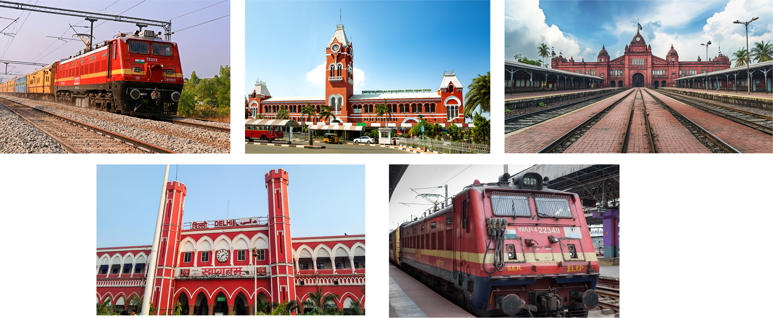
The original app's color scheme lacked consistency and contrast, making the website and mobile versions feel disconnected. I designed a new palette inspired by the earthy tones of major railway stations and trains, creating a more intuitive and familiar interface experience for users. This update enhances readability, maintains a professional look, and ensures a seamless user flow.
Logo
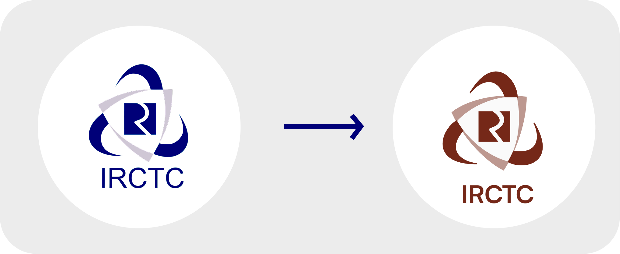
For the logo, I didn’t completely redesign it but made a small change. I replaced the blue color with my primary color to align the logo with the overall color palette. This change creates a more cohesive look, making the app feel more grounded and connected to its purpose. The earthy brown not only feels more natural but also enhances the overall professional and intuitive experience for users.
Typography
For the IRCTC mobile app redesign, I selected Satoshi for headers and Noto Sans for body text to enhance readability and accessibility. Satoshi’s modern and clean design ensures a professional yet approachable look, making key information easy to scan. Noto Sans, known for its versatility and extensive language support, ensures seamless readability across diverse regional users, aligning with IRCTC’s broad audience. Together, these typefaces create a cohesive, user-friendly experience that prioritizes clarity, accessibility, and visual consistency.


Wireframes

UI Kit & Components

Mock-ups
Key Takeaways from the Redesign
01 - Color Palette Inspiration:
I wanted to make the app feel more connected and intuitive for users. The brown tones inspired by railway stations and trains created a sense of familiarity. It was important to me that the color palette not only looked professional but also enhanced readability.
02 - Improving Mobile App Experience:
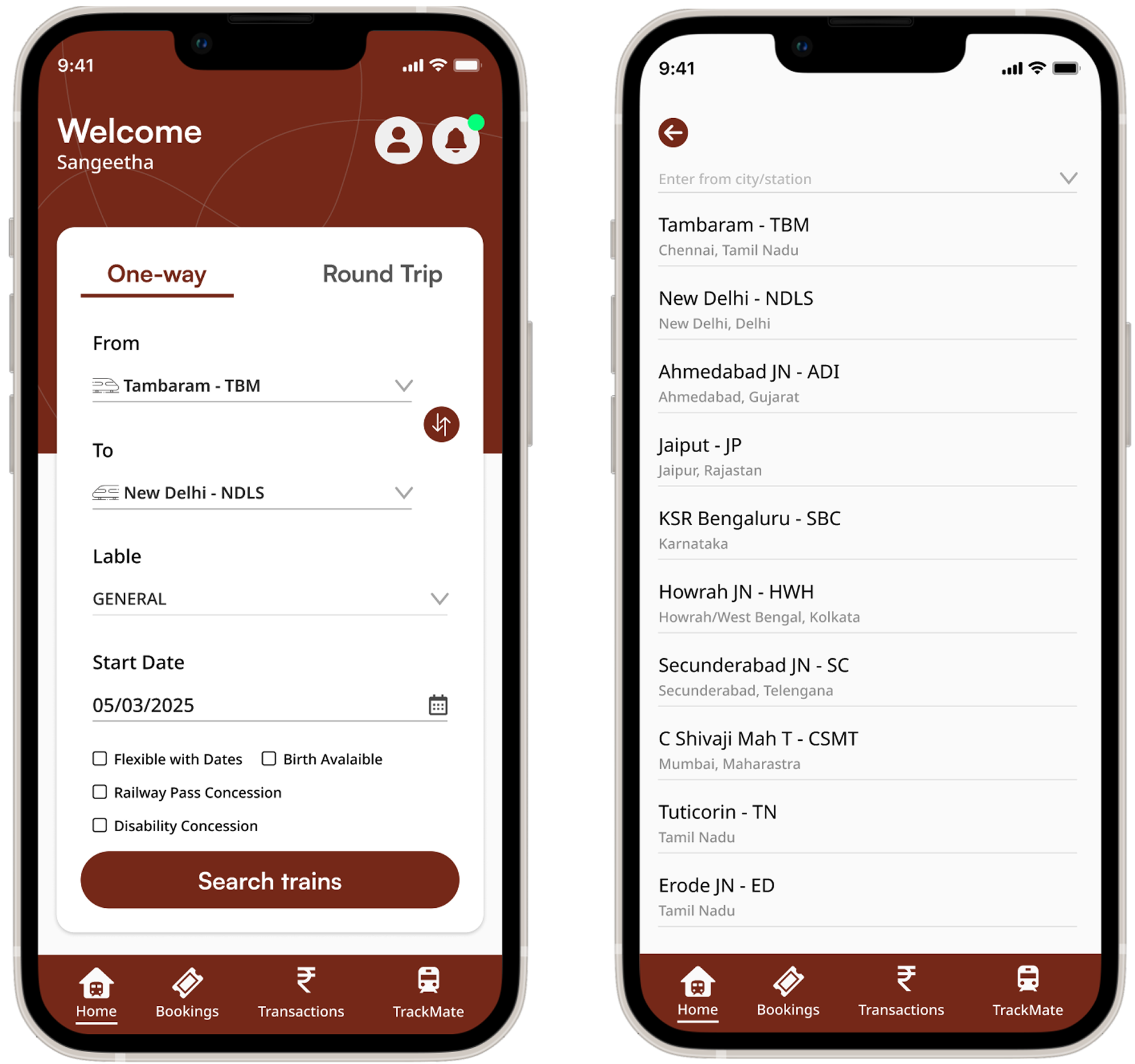
The existing mobile app had several usability issues, especially in terms of navigation and readability. I focused on making the app easier to use by simplifying the interface and enhancing key features like buttons and fonts to improve the overall user experience.
03 - Improving User Flow:
I noticed that users often struggled with navigating the app smoothly. By focusing on creating a more straightforward user flow, I aimed to eliminate unnecessary steps and make the process faster and more enjoyable for everyone.
Wrapping Up
01 - Closing Statement
Redesigning the IRCTC app was a passion project where I aimed to enhance the ticket booking experience by improving usability and visual appeal. This case study reflects my approach to problem-solving and design thinking.
02 - Next Steps
In the future, I would like to explore refining more sections, including the payment process and accessibility features, to make the experience even more seamless.
03 - Acknowledgment
This is a personal redesign project and is not affiliated with IRCTC.