What was my role?
"StoreSpy was my first project as a UI/UX designer, and honestly, it was both fun and full of
learning. I
was one of the UX/UI designers for StoreSpy, a mobile app that helps users quickly compare prices
and
find the best deals across stores.
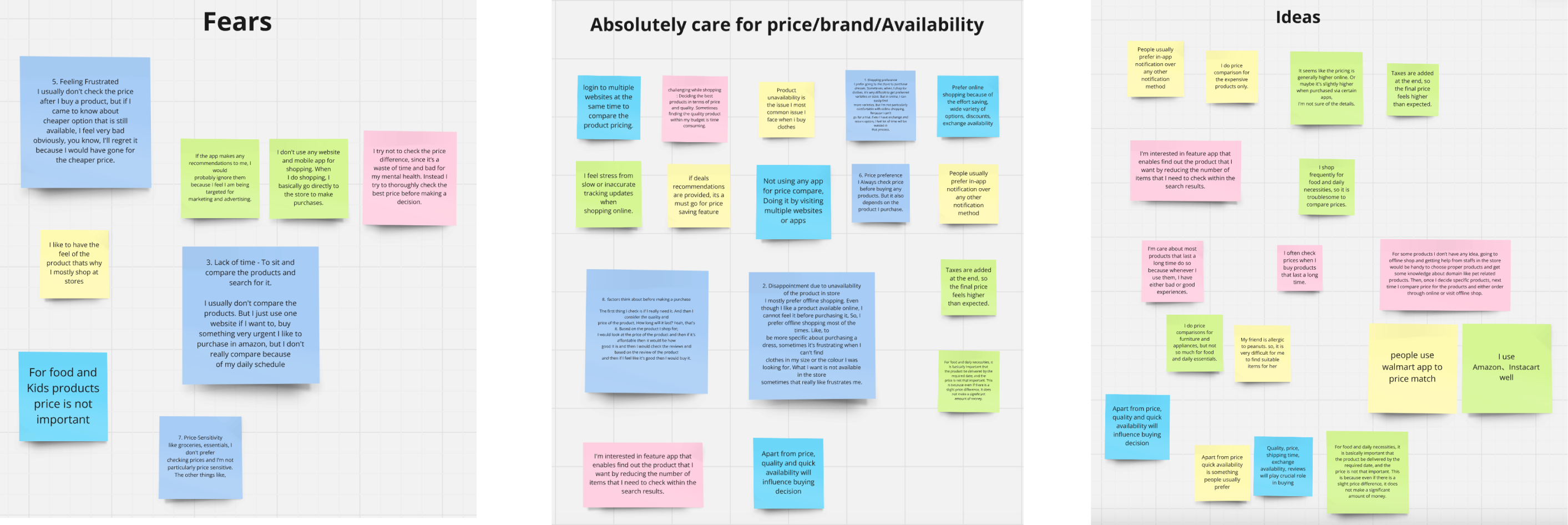
I started by digging into user pain points through research and created an affinity diagram and a
customer journey map to make sense of it all. Once I had a clear picture of what users really
needed, I
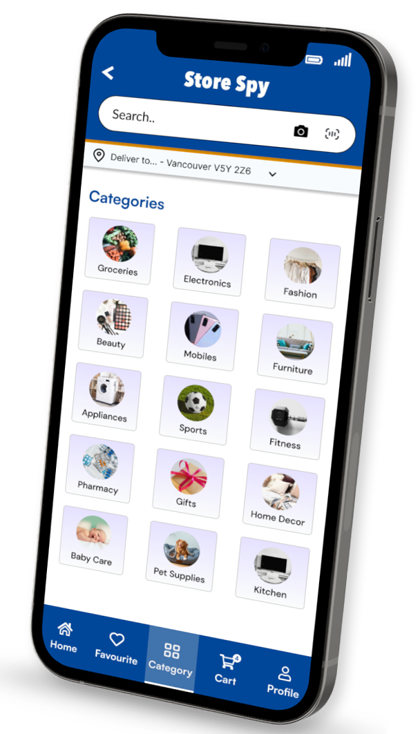
moved on to designing low- and mid-fidelity mobile screens for key features like product listings,
category views, favourites, cart, and user profile.
I also worked on building the prototype and paid extra attention to keeping the experience smooth
and
easy to follow. Along the way, I designed a set of custom icons to match the brand’s tone and
created a
couple of clean, fun illustrations for the flash screen to give the app a friendly and modern feel.
This project really helped me sharpen my skills in connecting user needs with design decisions. I
was
focused not just on how things look but how they actually work for real people using the app."
UX Research

1. Overview
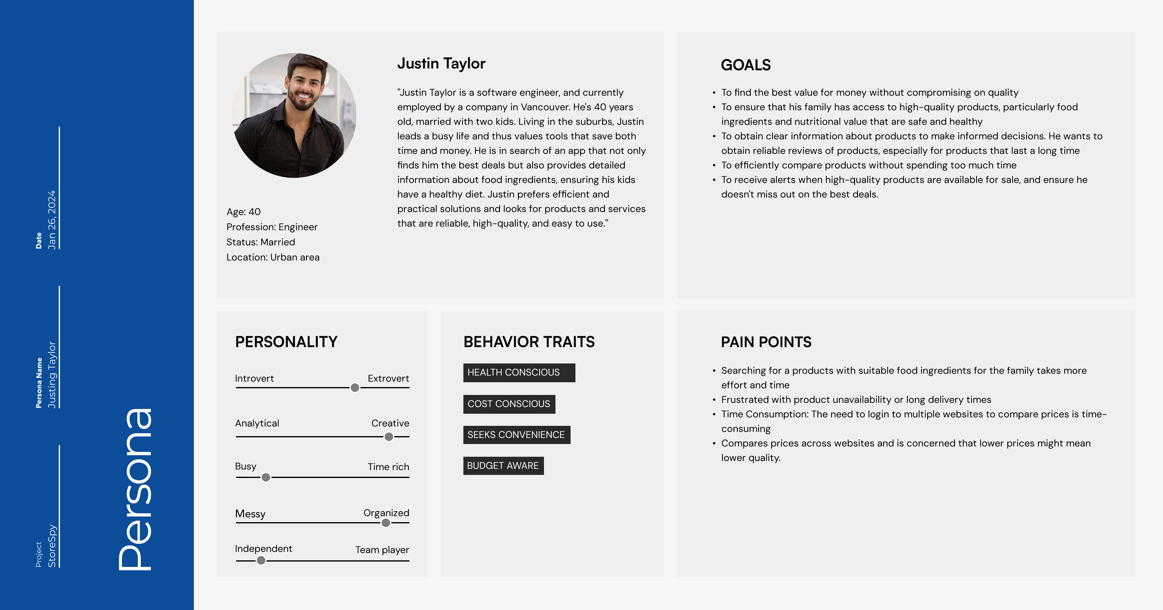
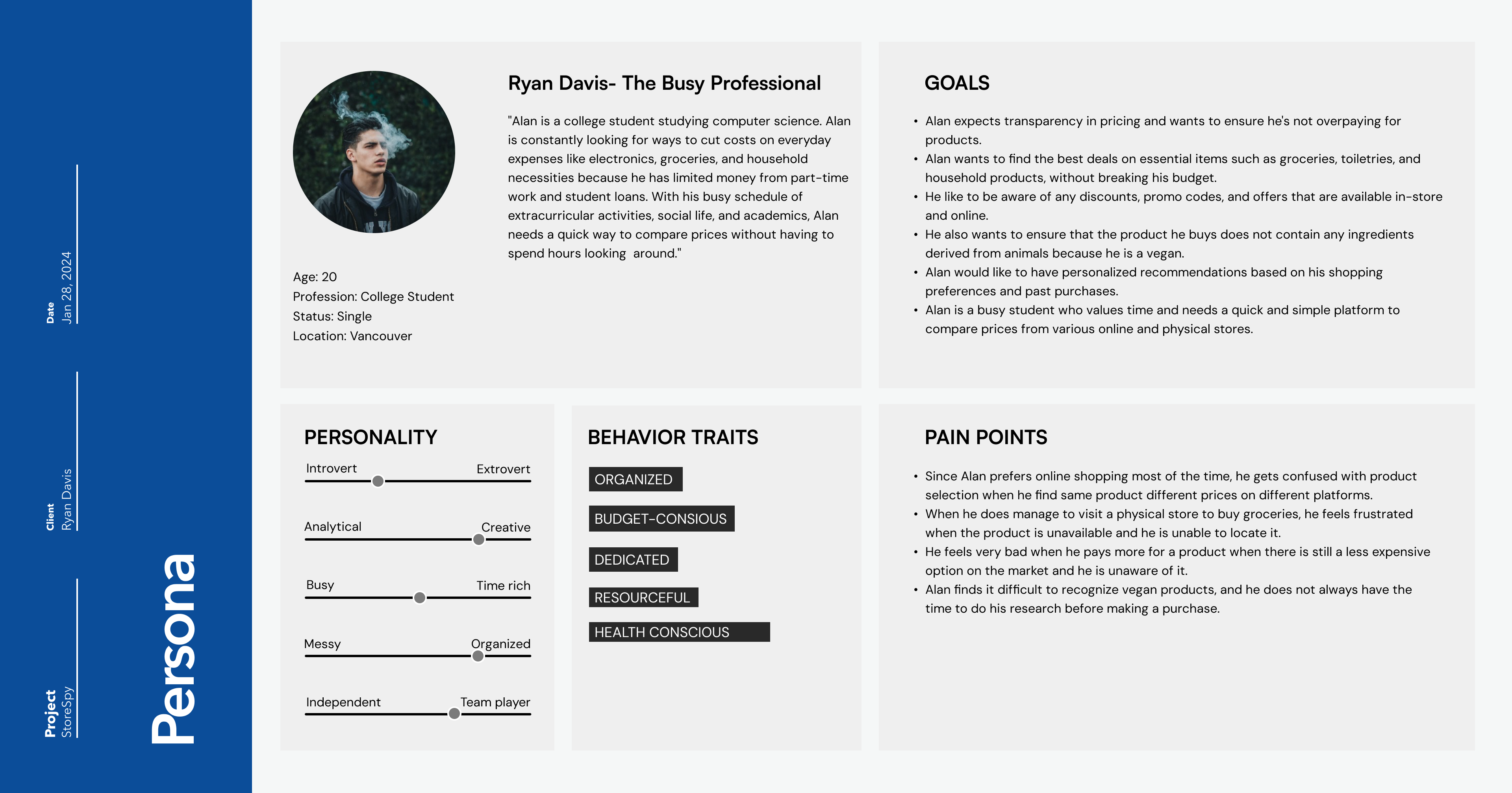
We aim to understand consumer behavior when purchasing products, focusing on their shopping experiences, preferences, challenges, price sensitivity, and key deciding factors.
Pain Point & User Motivation
Consumers today face challenges in comparing prices due to the vast number of online and offline retailers with varying pricing strategies. Hidden fees, fluctuating prices, and complex discounts further add to the frustration and uncertainty.
Consumers face challenges like spending significant time comparing prices across platforms, frustration with product unavailability or long delivery times, and the need for expertise when evaluating items such as vegan food, allergy-specific products, and technology-related goods.
2. Methodologies
In this user research, we conducted a survey and user interview.The survey was conducted from January 25, 2024 - February 8, 2024. During the survey, 39 participants were asked to spend 5 minutes online. User interview was conducted on February 1, 2024. During the interview, 6 participants were asked to spend 15 minutes with the site.
Customer Journey Map
ToGathr stands out from its competitors by offering a comprehensive solution for event planning. Unlike others that provide only partial features, such as budget tracking without vendor options or RSVP management without budget tracking, ToGathr integrates all essential tools in one platform. Additionally, it includes a collaborative workspace—a unique feature that enhances teamwork and coordination during event planning. Furthermore, ToGathr distinguishes itself with AI integration, a capability that none of its competitors currently offer.

Affinity Diagram
Lorem ipsum dolor sit amet, consectetur adipisicing elit. Itaque, nihil?
UX Design
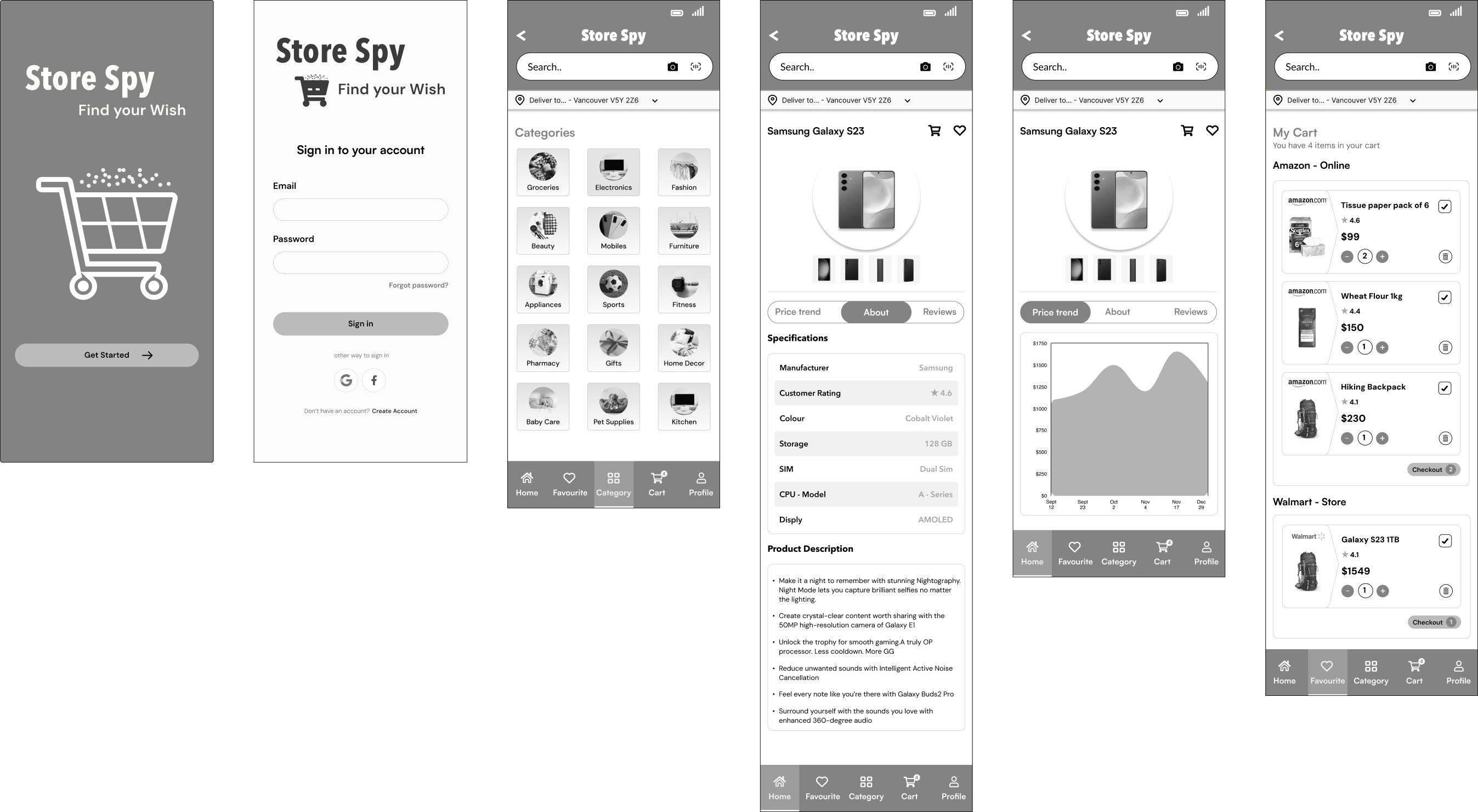
Our design process began with competitor analysis and user research, which informed the creation of an Information Architecture (IA) that served as the foundation for our user flows and wireframes. The platform's structure includes a landing page and login, leading to a dashboard that organizes tabs for core features, along with an overview page summarizing all sections. With the IA and user flows in place, we developed mid-fidelity wireframes to fully visualize and detail the platform's features. These wireframes evolved into high-fidelity mock-ups, incorporating branding, UI components, and supporting design elements such as custom illustrations.
1. Paper Wireframes
We created low-fidelity wireframes to map out Togathr's basic structure and user flow, focusing on essential screens like onboarding, event creation, dashboards for tasks, budget tracking, vendor search, and guest management. These wireframes outlined the app's functionality, including collaborative task management, budget visualization, RSVP tracking and guest check-in options. They provided a clear visual guide to align developers, designers, and stakeholders, helping us refine usability and identify improvements before moving to detailed designs.

2. Wireframes
We created low-fidelity wireframes to map out Togathr's basic structure and user flow, focusing on essential screens like onboarding, event creation, dashboards for tasks, budget tracking, vendor search, and guest management. These wireframes outlined the app's functionality, including collaborative task management, budget visualization, RSVP tracking and guest check-in options. They provided a clear visual guide to align developers, designers, and stakeholders, helping us refine usability and identify improvements before moving to detailed designs.
UI Design
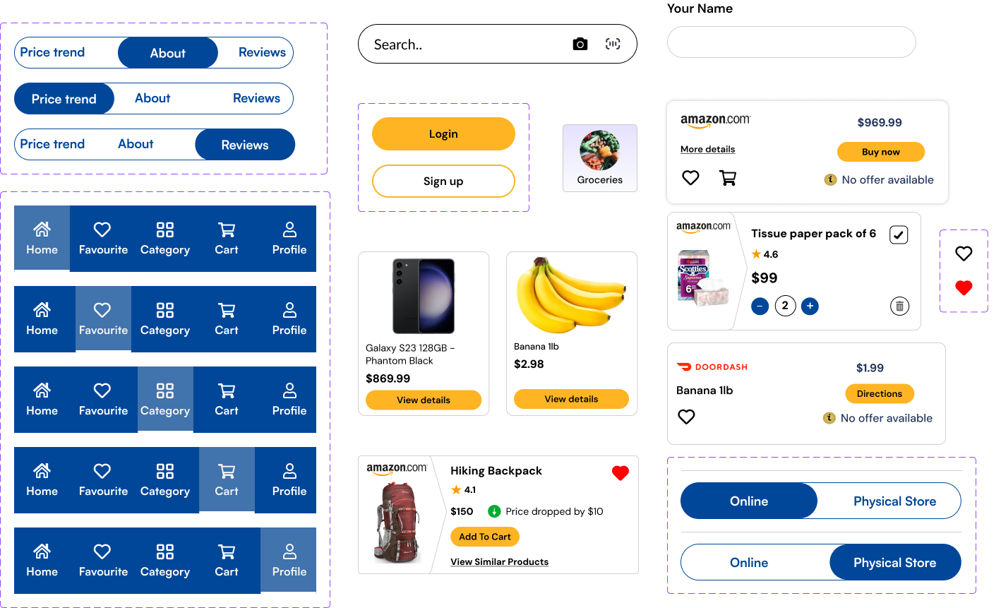
1. UI Library Components
The component library emphasizes rounded radius to maintain a clean and approachable aesthetic. Bold colors are balanced with ample white space and subtle lines. Custom illustrations, created in a line-drawing style with curves and no fills, complement the overall design and add a unique visual identity to the platform. This comprehensive design process brought our vision to life, creating a product that is functional, visually appealing, and user-centric.
2. Typography and Color Palette
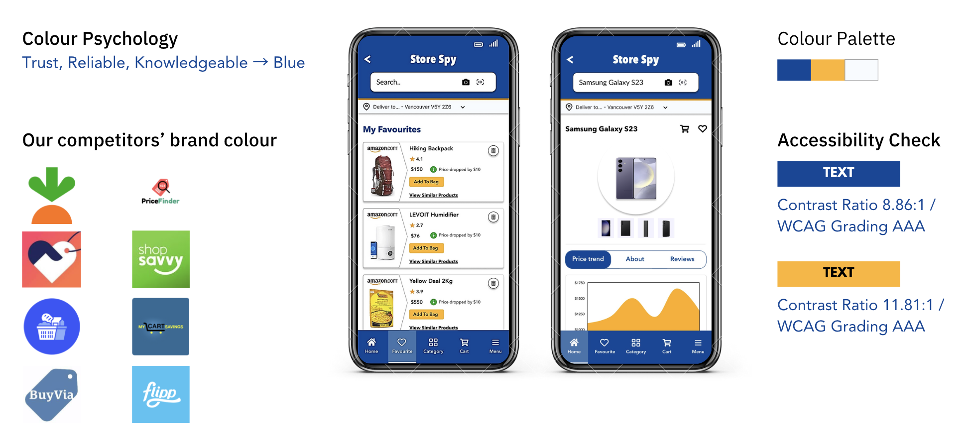
For branding, we identified key adjectives—seamless, boisterous, and memorable to
reflect
the excitement and energy of event planning. These guided the creation of a vibrant
and
versatile color palette suitable for various event types.
For typography, we chose Meta Pro for headings due to its character and flexibility,
paired with Noto Sans for body text for its versatility.
3. High-Fidelity Screens
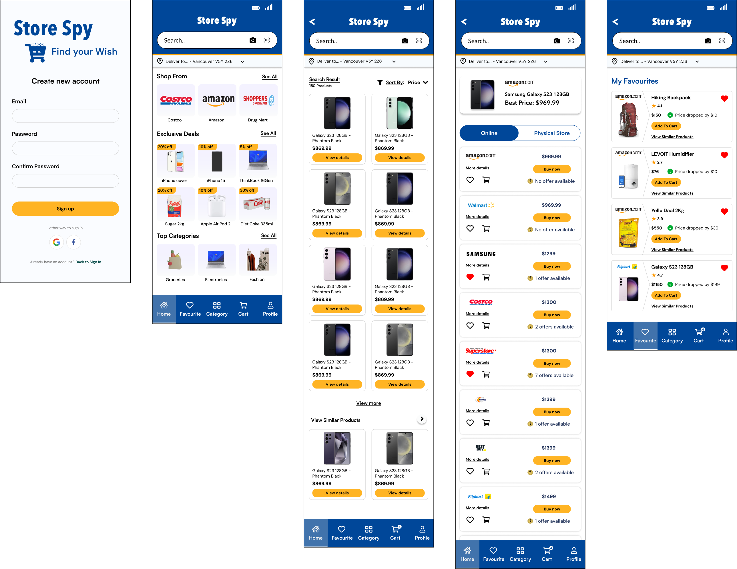
We developed high-fidelity wireframes for Togathr, showcasing detailed visual designs with polished layouts, colors, typography, and interactive elements. These wireframes accurately represented the final product, including screens for event creation, task management, vendor bookings, budget tracking, and guest RSVPs. They helped ensure alignment between the design and development teams, while also allowing stakeholders to visualize the user experience and provide feedback before development began.
Usability Test
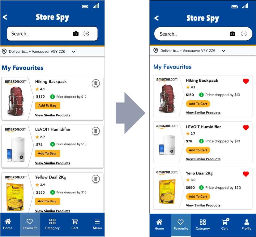
Following are the redesigned screens based on the usability test feedback for the StoreSpy application.
1. UI Enhancements for Improved Consistency and User Experience
i. Changed “Add to Bag” to “Add to Cart”:
The term "Add to Cart" is more commonly used in shopping apps and easier for users to understand. We updated the button label to keep it consistent and clear throughout the app.
ii. Replaced Trash Icon with Heart Icon on Favorites Page:
A trash icon gave the wrong impression on the Favorites page, as it's associated with deleting. We replaced it with a heart icon to better represent saved or liked items.
iii. Updated Footer Menu Icon to Account/User Profile Icon:
The menu icon in the footer was confusing for accessing user profiles. Switching to a user profile icon makes it clearer and easier for users to find their account settings.
iv. Made All Buttons Rounded for Consistency:
Some buttons had sharp corners, while others were rounded, which looked inconsistent. We updated all buttons to have rounded corners for a uniform and modern design.
2. Refining Footer Navigation for Better Usability
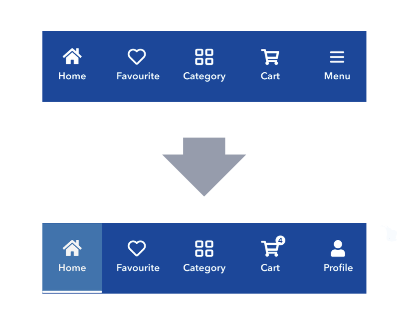
Initially, we planned to use filled icons in the footer to indicate the active page. However, after usability testing, we decided to use a highlighter with a shaded background and a bottom border for clearer visual feedback.
Key Challenges and Takeaways
Following are the key challenges and takeaways identified and documented by me during the development process of the StoreSpy application.
Key Challenges
1. Design Consistency:
Ensuring the app has a cohesive look and feel across all screens while keeping it user-friendly.
Solution: Work closely with the design team to establish clear design guidelines early on, so everyone is aligned.
2. Balancing Features:
Deciding which features to prioritize during development without overwhelming the user.
Solution: Collaborate with the team to narrow down features based on user feedback and core functionality, focusing on what truly adds value.
3. Real-Time Collaboration Tools:
Making sure the collaboration features (task assignments, updates) work smoothly for multiple users.
Solution: Test collaboration tools early in the design process to ensure they are intuitive and responsive for all users involved.
4. Responsive Design:
Ensuring the app works seamlessly across all devices (desktop, tablet, mobile).
Solution: Keep user experience consistent by designing with mobile-first principles and regularly testing across devices.
5. Feedback Loops:
Gathering and incorporating feedback from the team and users throughout the design process.
Solution: Set up regular check-ins with the team to discuss user feedback and adjust the design accordingly, keeping the app aligned with user needs.
Key Takeaways
1. Team Alignment:
Clear communication and consistent guidelines are essential to maintain design coherence.
2. Feature Prioritization:
Focus on the core features that solve real problems, based on team and user insights.
3. Testing Collaboration Tools:
Prioritize testing collaborative features to ensure they're seamless and easy to use.
4. Mobile-First Design:
Start with mobile design and ensure consistency across devices for a smooth user experience.
5. Iterate Based on Feedback:
Make design decisions that respond directly to feedback from both the team and users.
