This is a 12-week project developed by a team of 9 members includes 5 designers and 4 developers, with a strong focus on accessibility and creating a smooth, user-friendly experience.
Overview
My Role
UI/UX Research | UI/UX Designer
Duration & Team size
12 Weeks | 5 Designers | 4 Developers
Project Type
Mobile App, B2B & B2C Platform, Simplified Event Planning-Focused Product
Constraints
- - Web based solution that solves real-world issue
- - Compatible with Web and Mobile platforms
- - Should be Resonsive and have dashboard
Tools Used
Figma, FigJam, Pencil & Paper, Premiere Pro, After Effects
UX Research
1. The Problem
Event planning is a tedious work where we need to use too many apps, unreliable vendors, and confusing reviews. Finding good vendors? Sometimes even worse where most rely on word-of-mouth or sketchy reviews.
Pain Points
Planning an event involves juggling multiple apps for budget tracking, guest invites, vendor communication, and venue research. This fragmented process is time-consuming, stressful, and often leads to miscommunication and overlooked details.
User Motivation
Users want a simpler way to plan events - one platform that organizes everything in one place: guest lists, budgets, venues, and verified vendors. They seek trustworthy reviews, easy comparisons, and a more seamless, less overwhelming planning experience. Togather helps managing budgets, sending invites to guests, venues, and vendors across different apps is a headache. All in one platform - guest lists, verified vendors, budget tracking.

2. Methodologies
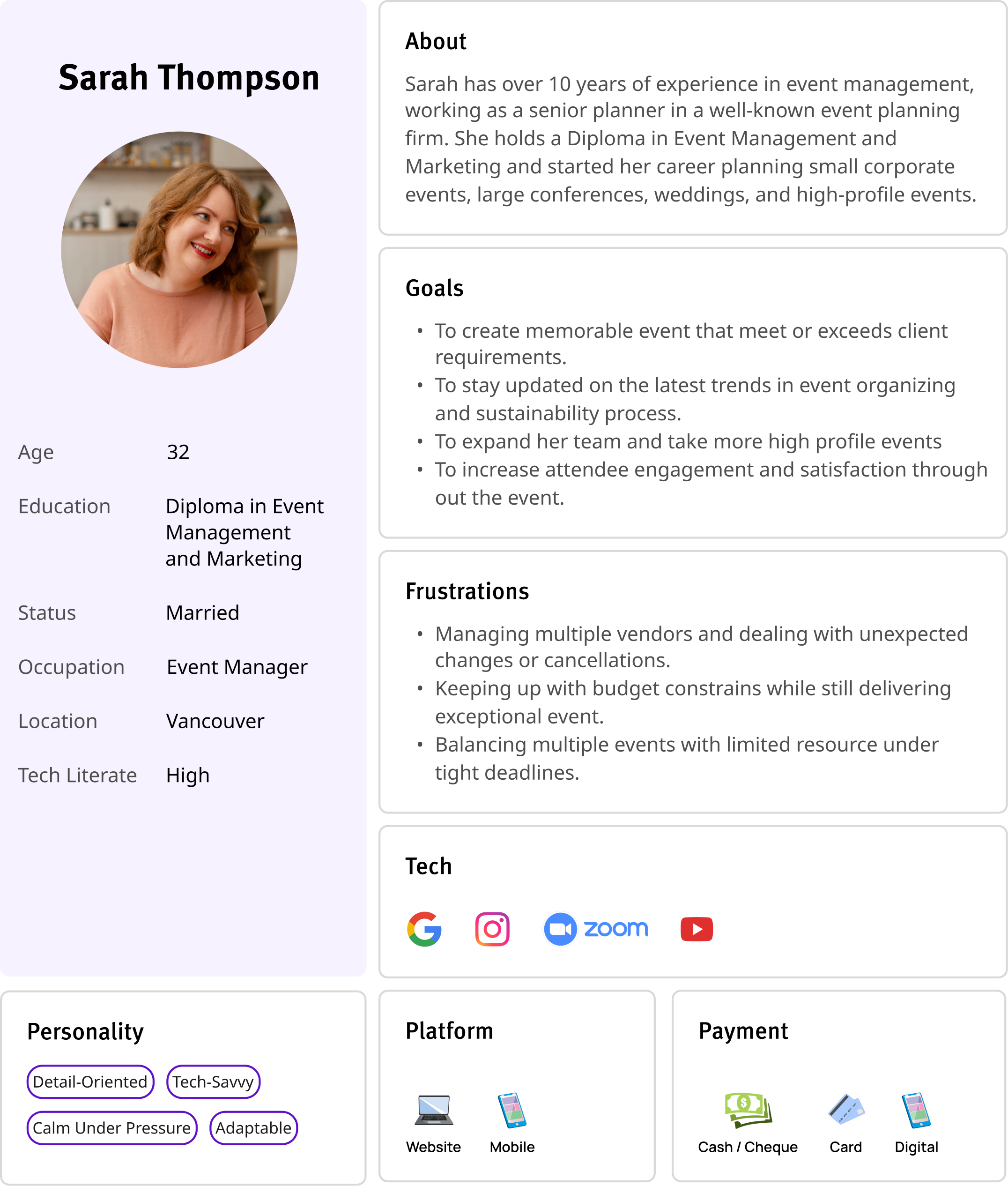
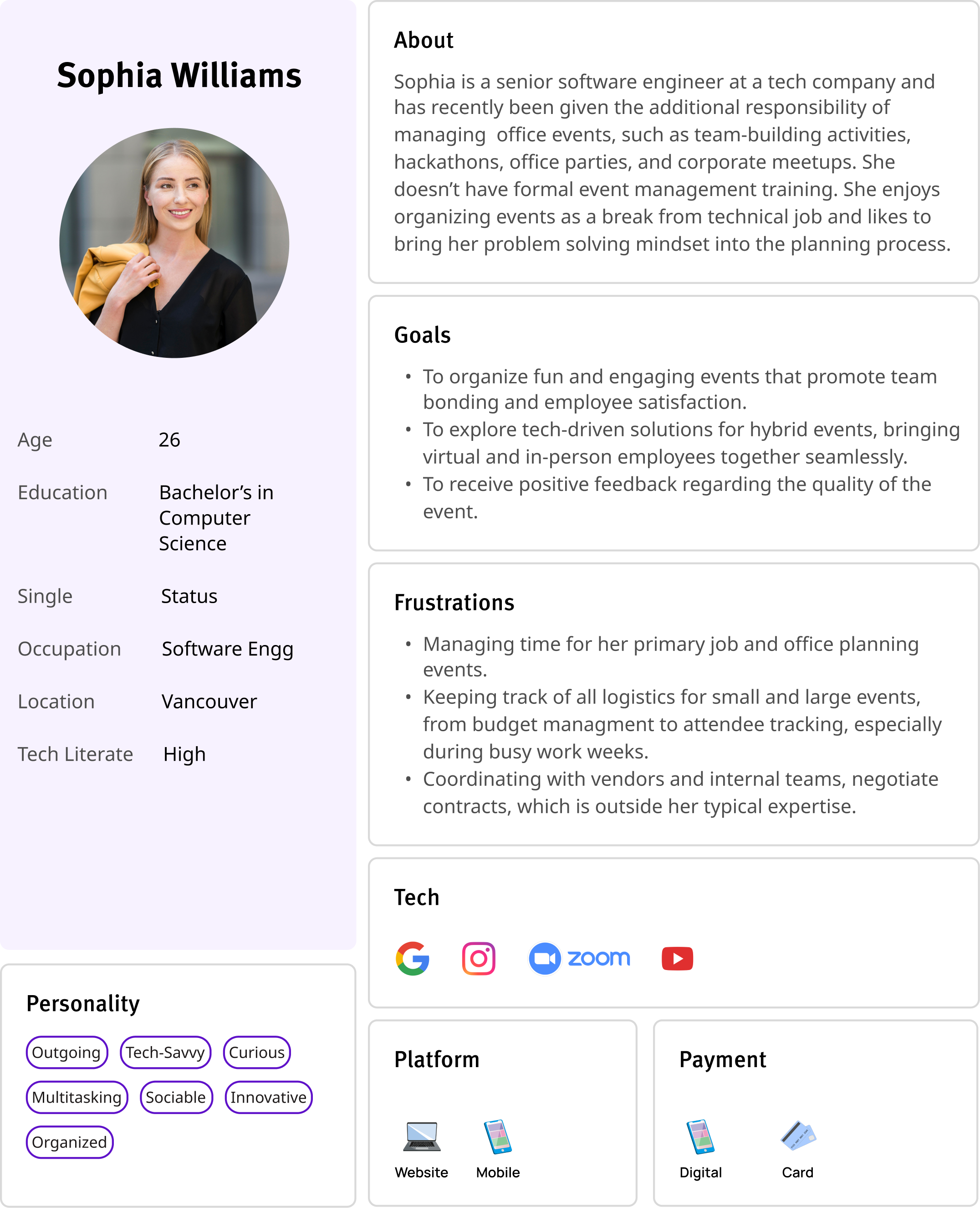
To build ToGathr, we started with a deep Competitor Analysis to spot market gaps and unique feature opportunities. User Interviews helped us understand real event planning struggles. From these insights, we created User Personas to shape our design. Following an Agile Design Approach, we iterated continuously, refining the app based on regular feedback.
Competitor Analysis
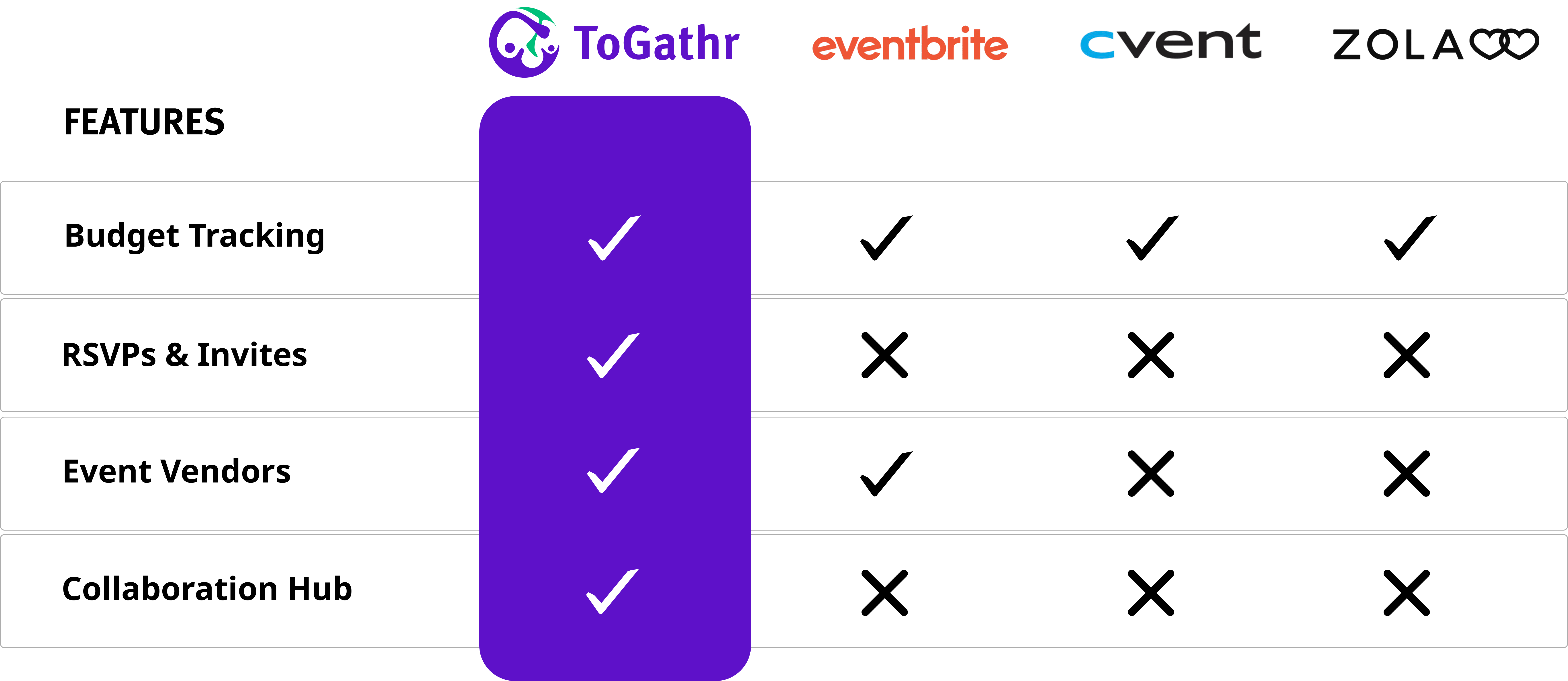
ToGathr stands out from its competitors by offering a comprehensive solution for event planning. Unlike others that provide only partial features, such as budget tracking without vendor options or RSVP management without budget tracking, ToGathr integrates all essential tools in one platform. Additionally, it includes a collaborative workspace—a unique feature that enhances teamwork and coordination during event planning. Furthermore, ToGathr distinguishes itself with AI integration, a capability that none of its competitors currently offer.

3. Design Thinking Workshop
As a collaborative team of developers and designers, we conducted a comprehensive Design Thinking Workshop to ideate and refine the Togathr application. This workshop included a structured plan to guide participants through each phase of the process. Starting with Empathy Mapping, we identified the core needs and pain points of users. We then defined clear problem statements and brainstormed innovative solutions during the Ideation Phase. These ideas were translated into quick Prototypes, enabling us to visualize the features. The workshop fostered cross-functional collaboration, encouraging diverse perspectives to shape the application's user-centric design.

UX Design
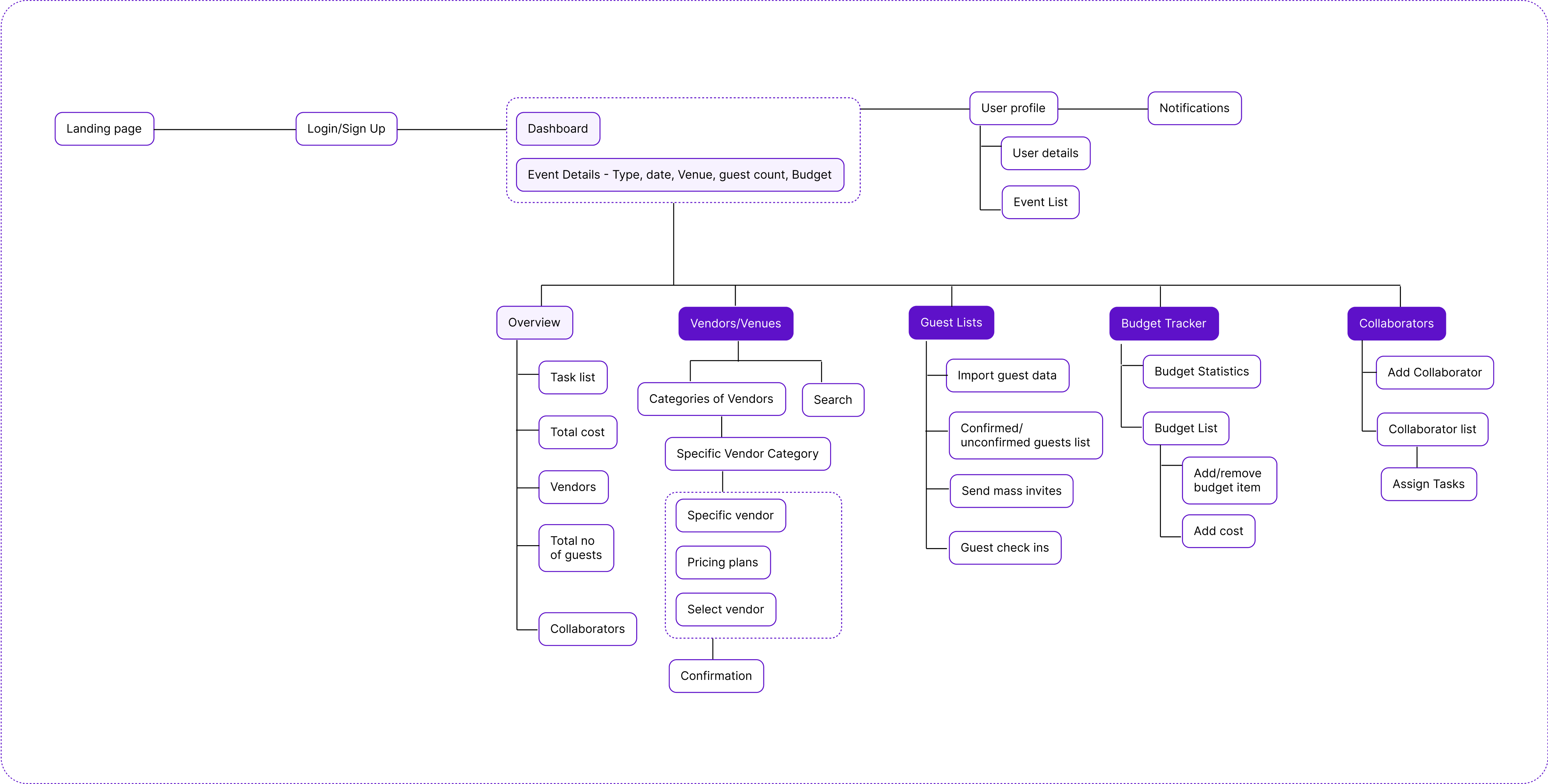
Our design process began with competitor analysis and user research, which informed the creation of an Information Architecture (IA) that served as the foundation for our user flows and wireframes. platform's structure includes a landing page and login, leading to a dashboard that organizes tabs for core features, along with an overview page summarizing all sections. With the IA and user flows in place, we developed mid-fidelity wireframes to fully visualize and detail the platform's features. These wireframes evolved into high-fidelity mock-ups, incorporating branding, UI components, and supporting design elements such as custom illustrations.
1. Information Architecture
ToGathr’s information architecture ensures easy navigation with clear sections. Using Card Sorting and User Flow Mapping, we designed a simple, intuitive layout for smooth event planning.
2. User Flow
After the research, I’ve identified two important flows Finding and booking vendors Managing the budget spent on event.
3. Wireframes
First, I’ve developed vendor booking screen, which I’ve divided in 3 main steps: List different Vendor categories, Search vendor, View vendor information(bio).Second, I focused on creating Login and onboarding flow.

UI Design
1. Brand Identity
Our Logo should convey simplicity, collaboration, and trust. we managed to use a modern, clean font combined with an abstract or event-related symbol. Ensure it's easily recognizable and works well in both full-color and monochrome formats. The logo design combines the concepts of people, celebration, and the letters T and G, encapsulating the essence of the platform.

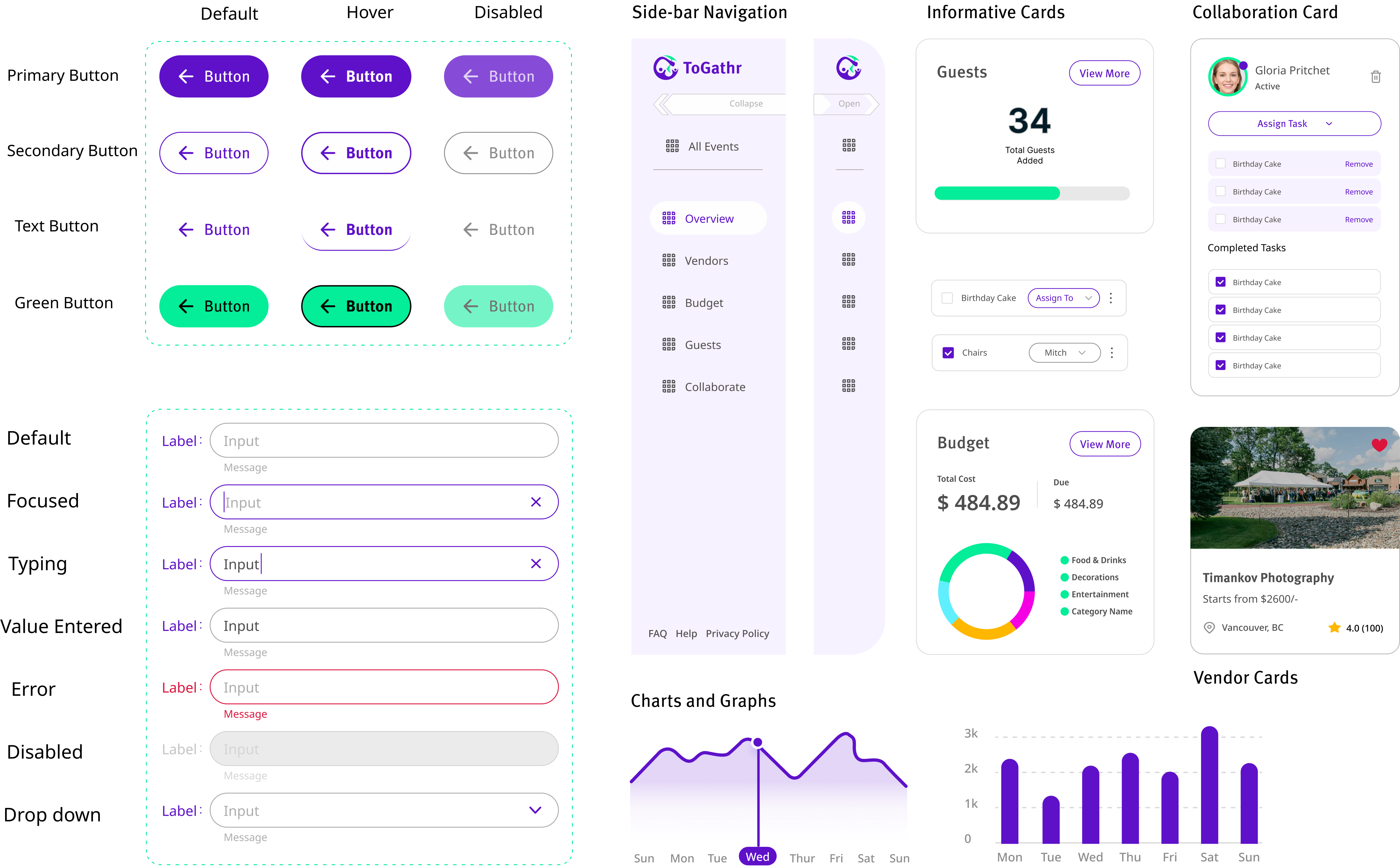
2. UI Library Components
The component library emphasizes rounded radius to maintain a clean and approachable aesthetic. Bold colors are balanced with ample white space and subtle lines. Custom illustrations, created in a line-drawing style with curves and no fills, complement the overall design and add a unique visual identity to the platform. This comprehensive design process brought our vision to life, creating a product that is functional, visually appealing, and user-centric.
3. Typography and Color Palette
For branding, we identified key adjectives - seamless, boisterous, and memorable to
reflect
the excitement and energy of event planning. These guided the creation of a vibrant
and
versatile color palette suitable for various event types.
For typography, we chose Meta Pro for headings due to its
character and flexibility,
paired with Noto Sans for body text for its versatility.


4. High-Fidelity Screens
We created high-fidelity wireframes for Togathr, showing detailed designs with layouts, colors, typography, and interactive elements. These wireframes represented the final product, including screens for event creation, task management, vendor bookings, budget tracking, and guest RSVPs. They helped align the design and development teams and gave stakeholders a chance to see and give feedback before development started.

Usability Test
Following are the redesigned screens based on the usability test feedback for the ToGathr application.
1. Side Bar Navigation
Based on the feedback, we redesigned the side navigation to remain open instead of being collapsed. This change improves discoverability and makes navigation more intuitive for users.

2. Added confirmation alerts in the required place
Users highlighted the need for confirmation alerts after completing specific actions. We implemented these alerts to provide feedback and reassurance for activities like adding items to the budget or composing guest invitations.

3. Simplified Guest Management Interface
To address the confusion caused by multiple Add Guest buttons, we redesigned the interface. The new design replaces the stacked layout with a tab-based view, which organizes information more effectively and reduces user confusion.

Marketing Materials
Following are the marketing materials, including a one-pager, LinkedIn post, and project proposal, designed by me to showcase the innovative features and user-focused enhancements of the ToGathr application.


Key Challenges and Takeaways
Following are the key challenges and takeaways identified and documented by me during the development process of the ToGathr application.
Key Challenges
1. Working as a Team in Agile:
In an Agile setup, things move fast—so staying in sync with the team was key.
What I did: Attended daily stand-ups, shared updates, and adapted designs quickly based on team input and sprint goals.
2. Balancing Features:
Deciding which features to prioritize during development. It was tempting to add everything! But too many features can clutter the experience.
What I did: Prioritized based on user feedback and stuck to features that actually helped users get things done.
3. Designing for Everyone, Everywhere:
Making sure the platform worked well across desktops, tablets, and mobile phones.
What I did: Designed with a mobile-first approach and tested on different screen sizes regularly.
4. Responsive Design:
Ensuring the app works seamlessly across all devices (desktop, tablet, mobile).
What I did: Keep user experience consistent by designing with mobile-first principles and regularly testing across devices.
5. Feedback Loops:
Gathering and incorporating feedback from the team and users throughout the design process.
What I did: Set up regular check-ins with the team to discuss user feedback and adjust the design accordingly, keeping the app aligned with user needs. We also conducted Usability testing to understand more feddback from users
Key Takeaways
1. Design is a Team Sport:
Regular check-ins and open feedback helped me improve designs and learn faster.
2. Less is More:
Choosing the most useful features made the platform easier and more enjoyable to use.
3. Users First, Always:
Real user feedback shaped our design decisions and taught me to see through the user’s eyes.
4. Stay Flexible:
Agile taught me to adapt quickly and keep iterating without losing focus.
5. Details Matter:
Even small visual tweaks (like icons or button placement) made a big difference in how the app felt.
6. Smooth Design Handoff is Key:
I made sure my designs were well-organized with documentation and Red lines and developer-ready, which helped speed up implementation and reduce confusion.

